A library is a collection of code units (functions, classes, variables) which
implement a set of related tasks.
In Python, matplotlib is the most widely used
library for scientific plotting.
We commonly use its pyplot module and import it as follows:
import matplotlib.pyplot as plt
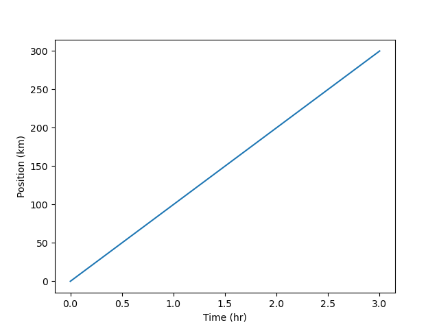
In Python, a module is an object which contains Python code and which can be imported inside another Python program. Simple plots are then (fairly) simple to create:
time = [0, 1, 2, 3]
position = [0, 100, 200, 300]

plt.plot(time, position)
plt.xlabel('Time (hr)')
plt.ylabel('Position (km)')

The Jupyter notebook renders plots inline by default.
Displaying All Open Figures
In our Jupyter notebook example, running the cell should generate the figure directly below the code. However, other Python environments (such as an interactive Python session started from a terminal or a Python script executed via the command line) require an additional command to display the figure:
plt.show()This command can also be used within a notebook – for instance, to display multiple figures if several are created by a single cell.
In Python, pandas is is the most widely used
library for data analysis and manipulation. Notably, it provides a very useful
data structure called a dataframe. Dataframes contain tabular data which
are:
To showcase the power and ease of use of pandas, let’s try it on some
oceanographic open data:
https://data.gov.ie/dataset/celtic-explorer-underway
Navigate to “available as CSV” and right-click the “Download” button (to copy
the URL).
We are passing this URL to pandas’s reading function as is, and it just
works! Alternatively, we could pass the path to a local data file (stored on
our machine). Note (from the file extension) that the data file is a zipped
CSV file, so pandas takes care of unzipping it first.
CSV stands for “comma-separated values” and it is a very common format for
storing tabular data. This open format is both human-readable and
machine-readable. Sometimes, instead of commas, values are separated by tabs
(TSV) or semicolons.
url = "http://atlas.marine.ie/midata/OceanFeatures/Celtic_Explorer_Underway.csv.zip"

import pandas as pd

df = pd.read_csv(url)
df.shape
(20845, 28)
What are the columns of this table?
df.columns
Index(['WKT', 'gml_id', 'OBJECTID', 'beginLifespanVersion',
       'endLifespanVersion', 'datasetName', 'localId', 'inspireId',
       'inspireTheme', 'version', 'description', 'longitude', 'latitude',
       'depth', 'depthUoM', 'value_', 'observedProperty',
       'observedPropertyUoM', 'resultQuality', 'resultTime', 'validTime',
       'process', 'scale', 'coordinateReferenceSystem',
       'styleLayerDescription', 'licence', 'dataProvenance', 'dataAccessUrl'],
      dtype='object')
We can access a given column using square brackets and the name (label) of this column in quotes. Each column is a series of data:
type(df['value_'])
pandas.core.series.Series
What is this dataset about?
df['description'].unique()
array(['Underway SBE 21 thermosalinograph sea surface temperature station'],
      dtype=object)
This dataset contains values of sea surface temperature (SST):
df['observedProperty'].unique()
array(['http://vocab.nerc.ac.uk/collection/P07/current/CFSN0381/'],
      dtype=object)
We can plot them readily by calling df['value_'].plot().
By default, this function plots the rows as the x-axis.
Many kinds of plots are available (see the official docs). For example, we may want to know how the SST values are distributed. We would then use a histogram:
# df['value_'].plot(kind='hist')
df['value_'].hist()
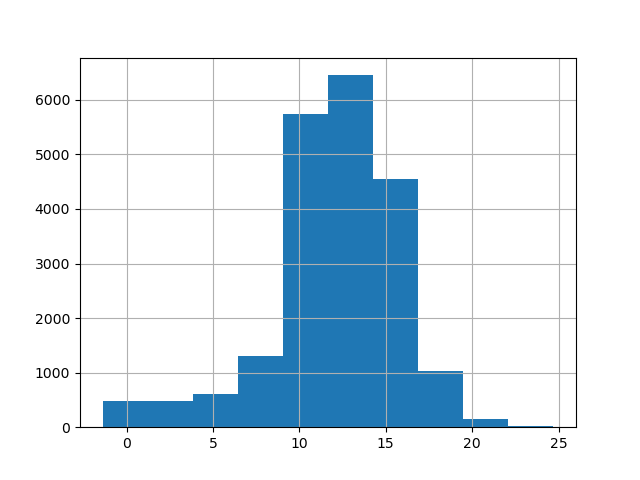
This implicitly uses matplotlib.pyplot.
Different styles are also available; to view them, run:
plt.style.available
['Solarize_Light2',
 '_classic_test_patch',
 '_mpl-gallery',
 '_mpl-gallery-nogrid',
 'bmh',
 'classic',
 'dark_background',
 'fast',
 'fivethirtyeight',
 'ggplot',
 'grayscale',
 'seaborn-v0_8',
 'seaborn-v0_8-bright',
 'seaborn-v0_8-colorblind',
 'seaborn-v0_8-dark',
 'seaborn-v0_8-dark-palette',
 'seaborn-v0_8-darkgrid',
 'seaborn-v0_8-deep',
 'seaborn-v0_8-muted',
 'seaborn-v0_8-notebook',
 'seaborn-v0_8-paper',
 'seaborn-v0_8-pastel',
 'seaborn-v0_8-poster',
 'seaborn-v0_8-talk',
 'seaborn-v0_8-ticks',
 'seaborn-v0_8-white',
 'seaborn-v0_8-whitegrid',
 'tableau-colorblind10']
plt.style.use('ggplot')
df['value_'].hist();
plt.xlabel('SST (Degrees Celsius)');
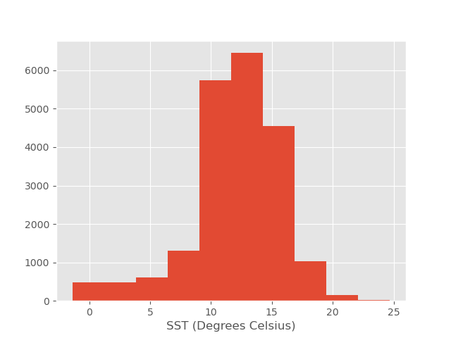
We have added semicolons to keep only the actual plot in the output.
Alternatively, we could call matplotlib.pyplot’s plot function explicitly:
plt.hist(df['value_']);
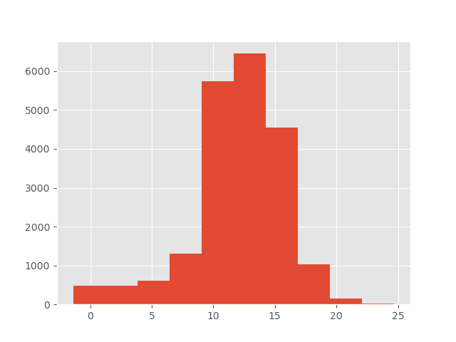
The colour can also be specified as an additional optional argument, e.g.,
'b' stands for blue:
df['value_'].hist(color='b');
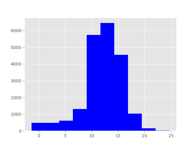
Changing Colours
- Change the histogram above so it is green instead of blue.
- (Re-)add a label for the x-axis (
xlabel).- Add a title for the overall plot (
title).Solution
df['value_'].hist(color='g');
plt.xlabel('SST (Degrees Celsius)');
plt.title('SST Measurements from the Celtic Explorer Underway');
Saving your Plot to a File
If you are satisfied with the plot you see, you may want to save it to a file, perhaps to include it in a publication. There is a function in the
matplotlib.pyplotmodule that accomplishes this: savefig. Calling this function, e.g., withplt.savefig('my_figure.png')will save the current figure to the file
my_figure.png. The file format will be automatically deduced from the filename extension (other formats are pdf, ps, eps, and svg).Note that functions in
pltrefer to a global figure variable, and after a figure has been displayed to the screen (e.g., withplt.show),matplotlibwill make this variable refer to a new empty figure. Therefore, make sure you callplt.savefigbefore the plot is displayed to the screen, otherwise you may end up with a file showing an empty plot.When using dataframes, data is often generated and plotted to screen in one line, so
plt.savefigseems not to work readily. One possibility is to:
- save a reference to the current figure in a local variable (using
plt.gcf);- call the
savefigmethod on that variable.data.plot(kind='bar') fig = plt.gcf() # get current figure fig.savefig('my_figure.png')
Choosing Data Structure and Plot Type
- We can create a dataframe by specifying the content of its columns:
table = pd.DataFrame({'Time': time, 'Position': position}). What doestable.plot();produce?- Plot Position against Time. One way of achieving it is
table.plot(x='Time', y='Position');. Another way istable.set_index('Time').plot();: Note that this turns thetable['Position']series into a timeseries, i.e., a series indexed in time order. In which cases would you favour one or the other?- What about
table.plot(kind='scatter', x='Time', y='Position');?Solution
- Both series are represented against their indices.
- Setting the Time column as the dataframe index might be useful if we wanted to include other data:
table.set_index('Time', inplace=True)
table['Position_2'] = [300, 400, 200, 100]
table.plot();
- A scatter plot is more suitable for representing data points. We could display a regression line to show the relationship between the two series (even if, in this case, it would be trivial!).
Making your Plots Accessible
Whenever you are generating plots to go into a paper or a presentation, there are a few things you can do to make sure that everyone can understand your plots.
- Make sure your text is large enough to read. Use the
fontsizeparameter inxlabel,ylabel,title, andlegend.- Similarly, you should make your graph elements easy to see. Use
linewidthto increase the size of your plot lines.- Using colour (and nothing else) to distinguish between different plot elements will make your plots unreadable to anyone who is colourblind, or who happens to have a black-and-white office printer. For lines, the
linestyleparameter lets you use different types of lines. For scatterplots,markerlets you change the shape of your points.